water resources.
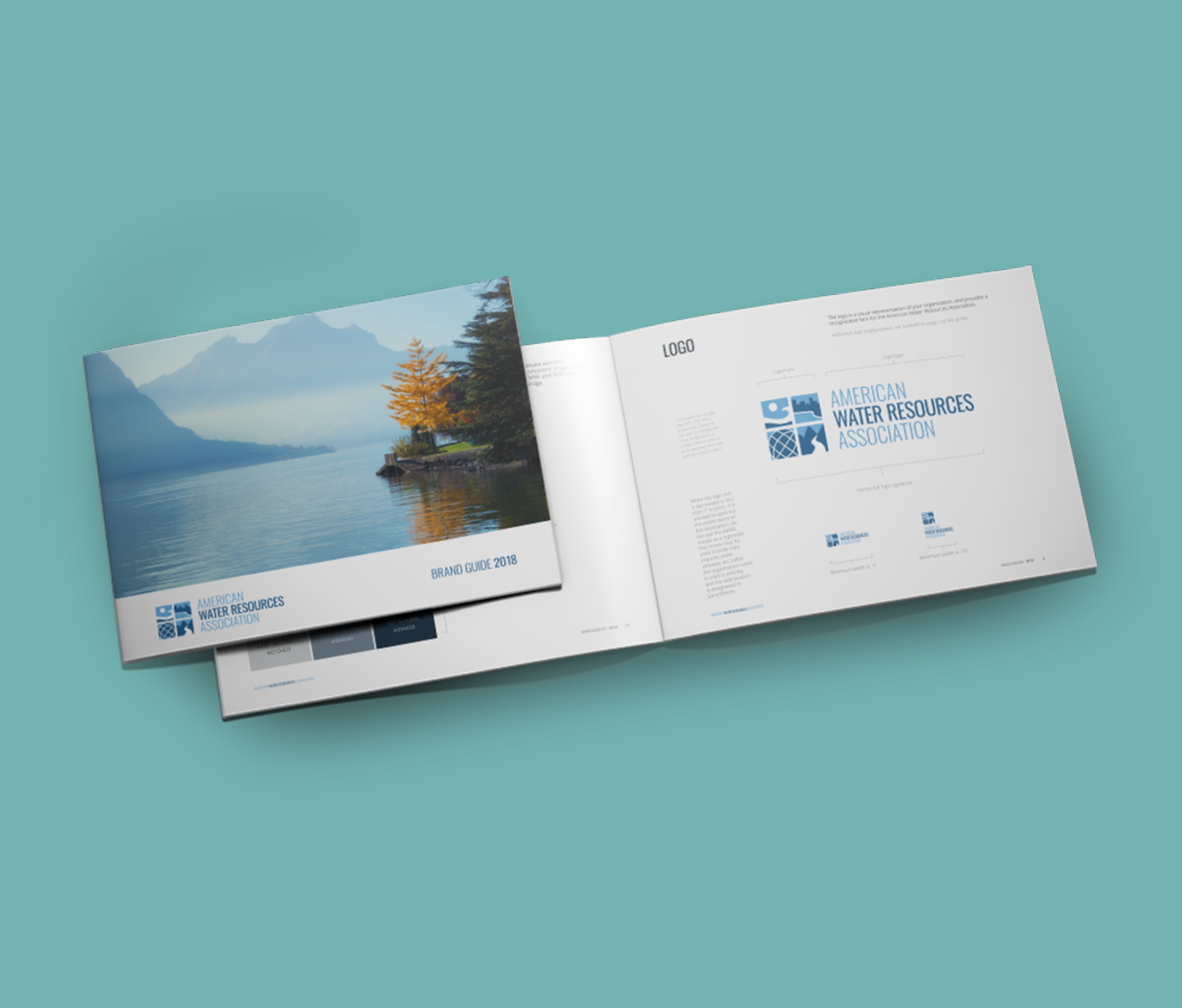
The American Association of Water Resources wanted to update the organization’s look but adhere to their brand that is well established in the community. The logo and brand refresh softened the color palette, smoothed out the iconography, and flattened the shapes in the logomark. The typeface went from a bulky copperplate to a clean condensed sans serif. The website was also brought into a “mobile first” space, with large hero images, and stackable dynamic content.